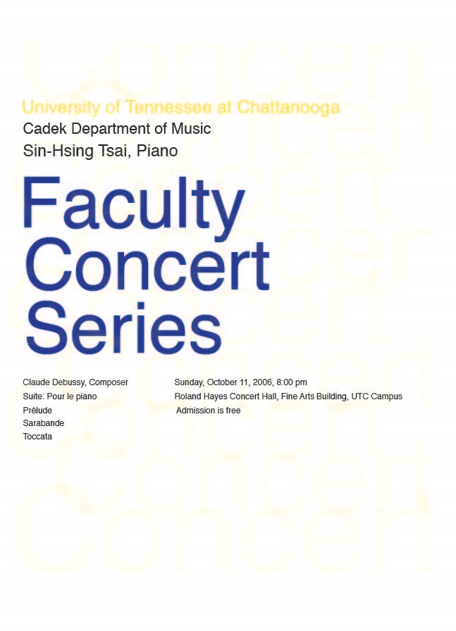
In project 2 we are trying to come up with ideas of comprising a musical concert poster with experimenting with color and text. Most of my inspiration comes from swiss poster that I have found online and also my thumbnails that I have sketched out. For my first idea I wanted to have a simple lay out that would get the point across clearly but would also have fun and excitement. I wanted to have the word concert in the background repeating because I believe it is the important word that grabs people's attention. I had experimented with the opacity so that it is not distracting but can be noticeable to add interested and texture to the page. I have 3 different layouts but all have the word concert repeating in the background. I wanted to try different colors to see what would be more eye appealing and also considered our own school colors since it is being performed on campus.
My other posters are a lot different than the others I combined the text together in three different parts so they would fit perfectly as a unit. In a concert performance you and your instrument are working together to put together a great performance. So these posters are combining together to draw attention to the concert series. They are all pretty much the same but with a few small changes on all of them and I experimented with different colors. My inspiration came from the swiss poster I found on the internet they seemed so simple but very effective and thats what I wanted my posters to portray.
Project 1: is comprised of five different CD covers all are different with different text and design.
My music that I had picked are John Mayor, Breaking Benjamin, Corey Smith, Lady Gaga and Dave Barnes. Starting out with John Mayor I thought when I was listening to his CD's was how mysterious he was all the music has a purpose and he using the words in a very intelligent way. Therefore, I was thinking of structure so, I chose to do variation of lines. These dark different size lines have the structure that I was looking for, they line up perfectly and create a well balanced composition.
Breaking Benjamin was a different type of design. They are dark and rough around the edges. I took the pencil tool and went to town on the page and filled it with black, this organic series of shapes are exactly what I wanted to get my edgy look. I choose a type face that was dark and bold because that is the personality of the band.
Corey Smith is more of a fun artist with happy songs. I choose to rearrange geometric shapes to add a playful look to my composition.
Lady Gaga has her own look her own music and is not afraid to show off her individuality. Therefore I made a design that has is unique in its own way. The text I choose as a retro look that seemed perfect for lady gaga's personality, with that her name is a more elegant typeface. The reason of this is because not only does lady gaga unique and expresses her own style she also appreciates beauty so her name has a beautiful and elegant feel to it.
Last but not least Dave Barnes has very relaxing music. He doesn't have a lot of instrumentals, nothing is overpowering. So I made a design what I thought was very relaxing. I took the paint tool and made very fluid motions that are light have the sense of them flowing around the text. I choose a typeface for his name that looks as though he signed his name himself. This keeps the cover simple and personable which a lot of his songs are exactly that.